Cumulative Frequency Graph
Related Pages
Frequency Table
Cumulative Frequency Table
More Statistics Lessons
In these lessons, we will learn how to draw a cumulative frequency graph (cumulative frequency curve) and how to find the median, quartiles and inter-quartile range.
What Is A Cumulative Frequency Graph?
A Cumulative Frequency Graph is a graph plotted from a cumulative frequency table. A cumulative frequency graph is also called an ogive or cumulative frequency curve. It is a graphical representation of the cumulative frequencies of a dataset. It is used to visualize the total number of observations that lie below certain values in a dataset. Cumulative frequency graphs are particularly useful for analyzing the distribution of data and finding percentiles, medians, and quartiles.
Statistics Worksheets
Practice your skills with the following worksheets:
Printable & Online Statistics Worksheets
The following examples show how to draw a cumulative frequency curve for grouped data.
Example:
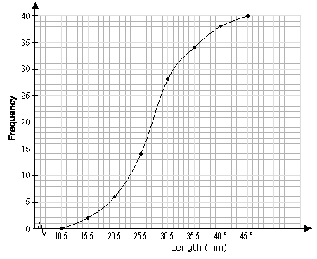
Draw a cumulative frequency graph for the frequency table below.
| Length (x mm) | Frequency |
| 11 – 15 | 2 |
| 16 – 20 | 4 |
| 21 – 25 | 8 |
| 25 – 30 | 14 |
| 31 – 35 | 6 |
| 36 – 40 | 4 |
| 41 – 45 | 2 |
Solution:
We need to add a class with 0 frequency before the first class and then find the upper boundary
for each class interval.
| Length (x mm) | Frequency | Upper Class Boundary | Length (x mm) | Cumulative Frequency |
| 6 – 10 | 0 | 10.5 | x ≤ 10.5 | 0 |
| 11 – 15 | 2 | 15.5 | x ≤ 15.5 | 2 |
| 16 – 20 | 4 | 20.5 | x ≤ 20.5 | 6 |
| 21 – 25 | 8 | 25.5 | x ≤ 25.5 | 14 |
| 25 – 30 | 14 | 30.5 | x ≤ 30.5 | 28 |
| 31 – 35 | 6 | 35.5 | x ≤ 35.5 | 34 |
| 36 – 40 | 4 | 40.5 | x ≤ 40.5 | 38 |
| 41 – 45 | 2 | 45.5 | x ≤ 45.5 | 40 |
And then plot the cumulative frequency against the upper class boundary of each interval and join the points with a smooth curve.

How To Obtain A Cumulative Frequency Graph From A Cumulative Frequency Table?
Calculate the cumulative frequency. Write down the upper class boundaries. Plot the cumulative frequency curve. Find the median values. Find the upper and lower quartiles. Find the inter-quartile range.
How To Draw A Cumulative Frequency Curve From A Cumulative Frequency Table?
How to draw a cumulative frequency curve from a cumulative frequency table and how to estimate the median, quartiles and interquartile range.
What Are Cumulative Frequency Diagrams?
Investigating cumulative frequencies and cumulative frequencies diagrams.
Cumulative Frequency - Median and Quartiles
Investigating how cumulative frequency diagrams are used to estimate the median and quartiles of a frequency distribution.
Uses of a Cumulative Frequency Graph
- Finding Percentiles:
The graph can be used to estimate the value below which a given percentage of the data falls. For example, the 50th percentile (median) is the value where the cumulative frequency is half of the total frequency. - Finding Quartiles:
The first quartile (Q1) is the value at 25% of the cumulative frequency.
The third quartile (Q3) is the value at 75% of the cumulative frequency. - Analyzing Data Distribution:
The shape of the graph helps identify whether the data is skewed or symmetric. - Comparing Datasets:
Multiple cumulative frequency graphs can be plotted on the same axes to compare distributions
Key Features of a Cumulative Frequency Graph
- The graph always starts at 0 (or the lowest class boundary).
- The curve is always non-decreasing (it never goes downward).
- The steepness of the curve indicates the concentration of data points in that range.
Try the free Mathway calculator and
problem solver below to practice various math topics. Try the given examples, or type in your own
problem and check your answer with the step-by-step explanations.

We welcome your feedback, comments and questions about this site or page. Please submit your feedback or enquiries via our Feedback page.