Math Statistics: Bar Charts/Bar Graphs
These lessons cover how to create and read bar charts and using bar charts to solve problems.
Related Pages
Graphical Methods For Describing Data
Stem and Leaf Diagrams
Cumulative Frequency Table
Statistics Lessons
A bar chart represents the data as horizontal or vertical bars. The length of each bar is proportional to the amount that it represents.
There are 3 main types of bar charts.
- Vertical bar chart
- Horizontal bar chart
- Double bar chart
When constructing a bar chart it is important to choose a suitable scale to represent the frequency.
Example:
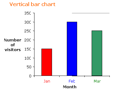
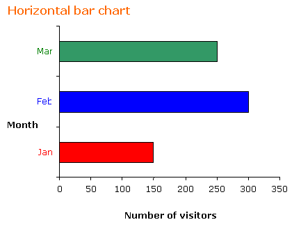
The following table shows the number of visitors to a park for the months January to March.
| Month | January | February | March |
| Number of visitors | 150 | 300 | 250 |
a) Construct a vertical and a horizontal bar chart for the table.
b) What is the percentage of increase of visitors to the park in March compared to January?
c) What percentage of visitors came in February compared with total number of visitors over the three months?
Solution:
a) If we choose a scale of 1:50 for the frequency then the vertical bar chart and horizontal bar
chart will be as shown.


b) Increase in March compared to January is
![]()
c) Percentage of visitors in February compared to the total number of visitors is
![]()
How to create bar graphs using given data, and answer questions based on given bar graphs?
A bar graph is a visual way to display and compare numerical data. The bars of a bar graph are
drawn in relation to a horizontal axis and a vertical axis. A bar graph can have either vertical
or horizontal bars.
Example:
Use the bar graph below to find the difference between the
speed limit on a state highway and a suburban street?
How to read bar graphs?
Reading bar graphs
Examples:
- Some students travel by train, airplane or boat during the summer. This bar graph shows how many students used each type of travel. How many more students traveled by airplane than boat?
- Sunny, Rover and Buster buried bones in the yard. This bar graph shows how many bones each dog buried. How many fewer bones did Rover bury than Sunny?
- The weather in November was sunny, cloudy, or rainy. This bar graph shows the number of days of each kind of weather. How many rainy days were there in November?
How to solve problems with bar graphs?
Examples:
- Lola asked her classmates their favorite type of movie and graphed the results. Which of the following types of movies were picked by fewer than 14 people?
- Puppy Party Place graphed the number of dogs that came in each weekday. On which day did the same number of dogs come to Puppy Party Place as on Monday and Wednesday combined?
- Desert Zone asked its customers about their favorite ice cream flavor and graphed the results. How many more customers picked the most popular flavor than the least popular flavor?
Double Bar Chart
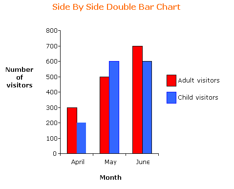
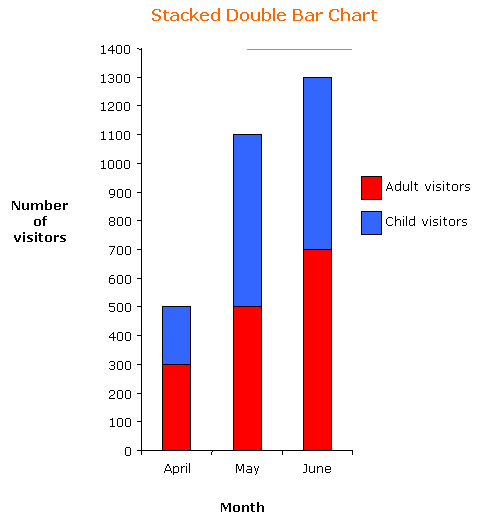
The double bar chart is used when we want to represent two sets of data on the same chart. We can put the bars side by side or we may put the bars of one set of data on top of the bars of the other set of data.
The choice of the forms of double bar chart – side by side or stacked, depends on the main purpose of the chart. A side by side chart is more useful when we compare the two sets of data (example: the number of adult visitors as compared to the number of child visitors); whereas the stacked chart emphasizes the totals of the two sets of data (example: total number of visitors).
Example:
The following frequency graph shows the number of adult visitors and child visitors to a park.
Construct a side by side double bar chart and a stacked double bar chart for the frequency table.
| Month | April | May | June |
| Number of adult visitors | 300 | 500 | 700 |
| Number of child visitors | 200 | 600 | 600 |
Solution:


How to read Double Bar Graphs?
How to solve problems using double bar graphs?
Example:
Based on the data below, which student’s score improved the most between the midterm and final exams?
Try out our new and fun Fraction Concoction Game.
Add and subtract fractions to make exciting fraction concoctions following a recipe. There are four levels of difficulty: Easy, medium, hard and insane. Practice the basics of fraction addition and subtraction or challenge yourself with the insane level.

We welcome your feedback, comments and questions about this site or page. Please submit your feedback or enquiries via our Feedback page.