Box Plot Worksheet
Related Topics:
More Grade 6 Math Lessons
Free Math Worksheets
Free Printable Worksheets
Printable “Statistics” Worksheets:
Mean, Median, Mode, Range
Mean Absolute Deviation
Interpret Mean Absolute Deviation
Interpret Median
Interquartile Range (IQR)
Box Plot (Box-and-whisker Plot)
Free printable and online worksheets to help Grade 6 students review how to construct a box plot, also known as a box-and-whisker plot, from a given set of data. How to use the median and the quartiles to construct a box plot? How to interpret a box plot?
Box Plot
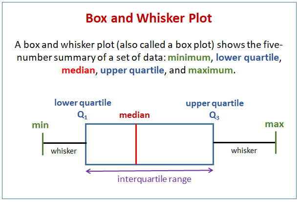
Constructing a box plot, also known as a box-and-whisker plot, is a method of visualizing the distribution of a dataset through its quartiles. A box plot provides a summary of the data’s central tendency, variability, and potential outliers.
Here are the steps on how to construct a box plot:
- Organize the Data:
Arrange the data points in ascending order. - Calculate the Five-Number Summary:
Minimum (Min): The smallest data point.
First Quartile (Q1): The median of the lower half of the data (25th percentile).
Median (Q2): The median of the data (50th percentile).
Third Quartile (Q3): The median of the upper half of the data (75th percentile).
Maximum (Max): The largest data point. - Determine the Interquartile Range (IQR):
IQR=Q3−Q1 - Construct the Box Plot:
- Draw a Number Line: Choose an appropriate scale to cover the range of the data.
- Draw the Box:
The left edge of the box is at Q1.
The right edge of the box is at Q3.
The line inside the box is at the median (Q2). - Draw the Whiskers:
Extend lines (whiskers) from the edges of the box to the smallest and largest data points within the bounds (not including outliers). - Plot Outliers: Plot any data points outside the whisker bounds as individual points.
Interpretation:
- The box represents the central 50% of the data (IQR).
- The line inside the box is the median.
- Whiskers extend to the smallest and largest values.
Box plots provide a clear visual summary of data distribution, central tendency, and variability, making them useful for comparing different datasets.

Have a look at this video if you need to review how to construct a box plot.
Click on the following worksheet to get a printable pdf document.
Scroll down the page for more Box Plot Worksheets.
More Box Plot Worksheets
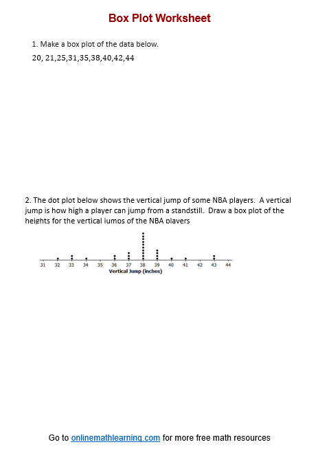
Printable
(Answers on the second page.)
Box Plot Worksheet #1
Box Plot Worksheet #2
Box Plot Worksheet #3
Related Lessons & Worksheets
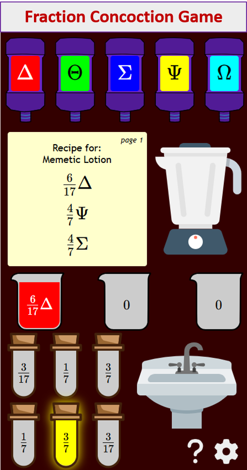
Try out our new and fun Fraction Concoction Game.
Add and subtract fractions to make exciting fraction concoctions following a recipe. There are four levels of difficulty: Easy, medium, hard and insane. Practice the basics of fraction addition and subtraction or challenge yourself with the insane level.

We welcome your feedback, comments and questions about this site or page. Please submit your feedback or enquiries via our Feedback page.
