Distributions and Their Shapes
Related Topics:
Lesson Plans and Worksheets for Algebra I
Lesson Plans and Worksheets for all Grades
More Lessons for Algebra I
Common Core For Algebra I
Examples, videos, and solutions to help Algebra I students learn how to use informal language to describe the shape, center, and variability of a distribution based on a dot plot, histogram, or box plot.
New York State Common Core Math Algebra I, Module 2, Lesson 1
Lesson 1 Student Outcomes
- Students learn how to use informal language to describe the shape, center, and variability of a distribution based on a dot plot, histogram, or box plot.
- Students recognize that a first step in interpreting data is making sense of the context.
- Students make meaningful conjectures to connect data distributions to their contexts and the questions that could be answered by studying the distributions.
What is Statistics?
Statistics is all about data. Without data to talk about or to analyze or to question, statistics would not exist. There is a story to be uncovered behind all data - a story that has characters, plots, and problems in the data. The questions or problems addressed by the data and their story can be disappointing, exciting, or just plain ordinary! This module is about stories that begin with data.
Lesson 1 Summary
Statistics is about data. Graphs provide a representation of the data distribution and are used to understand the data and to answer questions about the distribution.
Example 1: Graphs
Data are often summarized by graphs; the graphs are the first indicator of variability in the data.
Dot plots: A plot of each data value on a scale or number line.
Histograms: A graph of data that groups the data based on intervals and represents the data in each interval by a bar.
Box plots: A graph that provides a picture of the data ordered and divided into four intervals that each contains approximately 25% of the data.
The data may be symmetric or skewed.
Exit Ticket
- Sam said that a typical flight delay for the sixty BigAir flights was approximately one hour. Do you agree? Why or why not?
- Sam said that 50% of the twenty-two juniors at River City High School who participated in the walkathon walked at least ten miles. Do you agree? Why or why not?
- Sam said that young people from the ages of 0 to 10 years old make up nearly one-third of the Kenyan population. Do you agree? Why or why not?
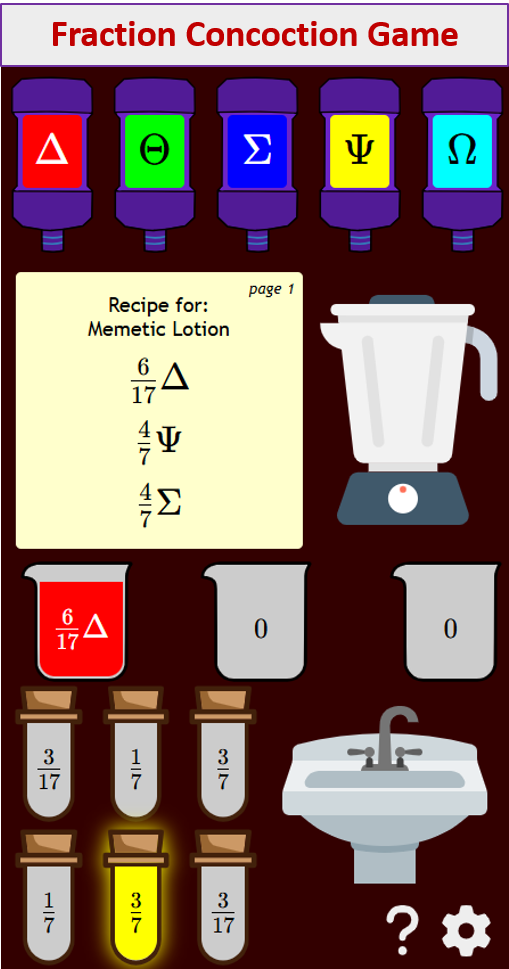
Try out our new and fun Fraction Concoction Game.
Add and subtract fractions to make exciting fraction concoctions following a recipe. There are four levels of difficulty: Easy, medium, hard and insane. Practice the basics of fraction addition and subtraction or challenge yourself with the insane level.

We welcome your feedback, comments and questions about this site or page. Please submit your feedback or enquiries via our Feedback page.