Illustrative Mathematics Grade 8, Unit 6, Lesson 1: Organizing Data
Learning Targets:
- I can organize data to see patterns more clearly.
Related Pages
Illustrative Math
Grade 8
Lesson 1: Organizing Data
Let’s find ways to show patterns in data.
Illustrative Math Unit 8.6, Lesson 1 (printable worksheets)
Lesson 1 Summary
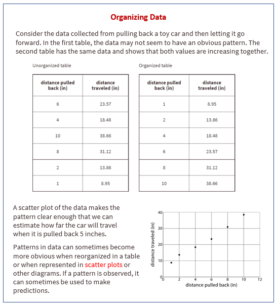
The following diagram shows how to organize data to see patterns more clearly.

Lesson 1.1 Notice and Wonder: Messy Data
Here is a table of data. Each row shows two measurements of a triangle.
What do you notice? What do you wonder?
Lesson 1.2 Seeing the Data
Here is the table of isosceles right triangle measurements from the warm-up and an empty table.
- How can you organize the measurements from the first table so that any patterns are easier to see? Write the organized measurements in the empty table.
- For each of the following lengths, estimate the perimeter of an isosceles right triangle whose short sides have that length. Explain your reasoning for each triangle.
a. length of short sides is 0.75 cm
b. length of short sides is 5 cm
c. length of short sides is 10 cm
Are you ready for more?
In addition to the graphic representations of data you have learned, there are others that make sense in other situations. Examine the maps showing the results of the elections for United States president for 2012 and 2016. In red are the states where a majority of electorate votes were cast for the Republican nominee. In blue are the states where a majority of the electorate votes were cast for the Democrat nominee.
- What information can you see in these maps that would be more difficult to see in a bar graph showing the number of electorate votes for the 2 main candidates?
- Why are these representations appropriate for the data that is shown?
Lesson 1.3 Tables and Their Scatter Plots
Here are four scatter plots. Your teacher will give you four tables of data.
- Match each table with one of the scatter plots.
- Use information from the tables to label the axes for each scatter plot.
Lesson 2.4 Same Function, Different Rule?
Which input-output rules could describe the same function (if any)? Be prepared to explain your reasoning.
Lesson 1 Practice Problems
- Here is data on the number of cases of whooping cough from 1939 to 1955.
a. Make a new table that orders the data by year.
b. Which years in this period of time had fewer than 100,000 cases of whooping cough?
c. Based on this data, would you expect 1956 to have closer to 50,000 cases or closer to 100,000 cases? - In volleyball statistics, a block is recorded when a player deflects the ball hit from the opposing team. Additionally, scorekeepers often keep track of the average number of blocks a player records in a game. Here is part of a table that records the number of blocks and blocks per game for each player in a women’s volleyball tournament. A scatter plot that goes with the table follows.
Label the axes of the scatter plot with the necessary information. - A cylinder has a radius of 4 cm and a height of 5 cm.
a. What is the volume of the cylinder?
b. What is the volume of the cylinder when its radius is tripled?
c. What is the volume of the cylinder when its radius is halved?
The Open Up Resources math curriculum is free to download from the Open Up Resources website and is also available from Illustrative Mathematics.
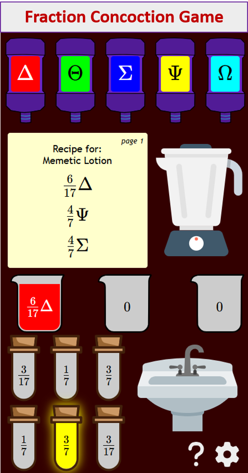
Try out our new and fun Fraction Concoction Game.
Add and subtract fractions to make exciting fraction concoctions following a recipe. There are four levels of difficulty: Easy, medium, hard and insane. Practice the basics of fraction addition and subtraction or challenge yourself with the insane level.

We welcome your feedback, comments and questions about this site or page. Please submit your feedback or enquiries via our Feedback page.