Illustrative Mathematics Grade 8, Unit 6, Lesson 3: What a Point in a Scatter Plot Means
Learning Targets:
- I can describe the meaning of a point in a scatter plot in context.
Related Pages
Illustrative Math
Grade 8
Lesson 3: What a Point in a Scatter Plot Means
Let’s investigate points in scatter plots.
Illustrative Math Unit 8.6, Lesson 3 (printable worksheets)
Lesson 3 Summary
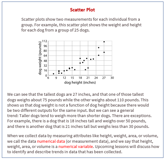
The following diagram shows how to describe the meaning of a point in a scatter plot in context.

Lesson 3.1 The Giant Panda
A giant panda lives in a zoo. What does the point on the graph tell you about the panda?
Lesson 3.2 Weight and Fuel Efficiency
The table shows the weight and fuel efficiency of 18 different cars.
The data points in the table are shown in this scatter plot.
You can hide the expressions list using the double arrow. You can click on a point to see its coordinates.
Open Applet
- Which point in the scatter plot represents Car L’s measurements? Drag the circle around the correct point.
- What is the fuel efficiency of the car with the greatest weight?
- What is the weight of the car with the greatest fuel efficiency?
- Car S weighs 1,912 kilograms and gets 16 miles per gallon. On the scatter plot, plot a point that represents Car S’s measurements.
- Cars N and O, shown in the scatter plot, are made by the same company. Compare their weights and fuel efficiencies. Does anything surprise you about these cars?
- A different company makes Cars F and G. Compare their weights and fuel efficiencies. Does anything surprise you about these cars?
Are you ready for more?
After a board game competition, the tournament director collects 50 dice from the games played and rolls each one until he gets bored and tries a different one. The scatter plot shows the number of times he rolled each die and the number of 6s that resulted during those rolls.
Select a point in the scatter plot and give its approximate coordinates, then tell the story of that point in the context of the problem.
Lesson 3.3 Coat Sales
A clothing store keeps track of the average monthly temperature in degrees Celsius and coat sales in dollars.
- What does the point (15,680) represent?
- For the month with the lowest average temperature, estimate the total amount made from coat sales. Explain how you used the table to find this information.
- For the month with the smallest coat sales, estimate the average monthly temperature. Explain how you used the scatter plot to find this information.
- If there were a point at (0,A) what would it represent? Use the scatter plot to estimate a value for A.
- What would a point at (B,0) represent? Use the scatter plot to estimate a value for B.
- Would it make sense to use this trend to estimate the value of sales when the average monthly temperature is 60 degrees Celsius? Explain your reasoning.
Lesson 3 Practice Problems
- Here is a table and a scatter plot that compares points per game to free throw attempts for a basketball team during a tournament.
a. Circle the point that represents the data for Player E.
b. What does the point (2.1,18.6) represent?
c. In that same tournament, Player O on another team scored 14.3 points per game with 4.8 free throw attempts per game. Plot a point on the graph that shows this information. - Select all the representations that are appropriate for comparing exam score to number of hours of sleep the night before the exam.
A. Histogram
B. Scatter plot
C. Dot plot
D. Table
E. Box plot - A cone has a volume of 36π cm3 and height h. Complete this table for volume of cylinders with the same radius but different heights.
The Open Up Resources math curriculum is free to download from the Open Up Resources website and is also available from Illustrative Mathematics.
Try the free Mathway calculator and
problem solver below to practice various math topics. Try the given examples, or type in your own
problem and check your answer with the step-by-step explanations.

We welcome your feedback, comments and questions about this site or page. Please submit your feedback or enquiries via our Feedback page.