Illustrative Mathematics Grade 6, Unit 8, Lesson 18: Using Data to Solve Problems
Learning Targets:
- I can decide whether mean and MAD or median and IQR would be more appropriate for describing the center and spread of a data set.
- I can draw an appropriate graphical representation for a set of data.
- I can explain what the mean and MAD or the median and IQR tell us in the context of a situation and use them to answer questions.
Related Pages
Illustrative Math
Grade 6
Lesson 18: Using Data to Solve Problems
Let’s compare data sets using visual displays
Illustrative Math Unit 6.8, Lesson 18 (printable worksheets)
Lesson 18 Summary
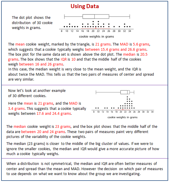
The following diagram shows how to decide whether mean and MAD or median and IQR would be more appropriate for describing the center and spread of a data set.

Lesson 18.1 Wild Bears
In one study on wild bears, researchers measured the head lengths and head widths, in inches, of 143 wild bears. The ages of the bears ranged from newborns (0 years) to 15 years. The box plots summarize the data from the study.
- Write four statistical questions that could be answered using the box plots: two questions about the head length and two questions about the head width.
- Trade questions with your partner.
a. Decide if each question is a statistical question.
b. Use the box plots to answer each question.
Lesson 18.2 Math Homework (Part 1)
Over a two-week period, Mai had the following number of math homework problems each school day.
- Calculate the following. Show your reasoning.
a. The mean number of math homework problems.
b. The mean absolute deviation (MAD). - Interpret the mean and MAD. What do they tell you about the number of homework problems Mai had over these two weeks?
- Find or calculate the following values and show your reasoning.
a. The median, quartile, maximum, and minimum of the same data on Mai’s math homework problems.
b. The interquartile range (IQR). - Which pair of measures of center and variability—mean and MAD, or median and IQR—do you think summarize the distribution of Mai’s math homework assignments better? Explain your reasoning.
You may use the applet below to help if you choose to. Enter the values needed to calculate the IQR and the mean when prompted.
Open Applet
Lesson 18.3 Math Homework (Part 2)
Jada wanted to know whether a dot plot, a histogram, or a box plot would best summarize the center, variability, and other aspects of her homework data.
- Use the axis to make a dot plot to represent the data. Mark the position of the mean, which you calculated earlier, on the dot plot using a triangle. From the triangle, draw a horizontal line segment to the left and right sides to represent the MAD.
- Use the five-number summary from the previous task and the grid to draw a box plot that represents Jada’s homework data.
- Work with your group to draw three histograms to represent Jada’s homework data. The width of the bars in each histogram should represent a different number of homework problems, as specified.
a. One bar represents 10 problems.
b. One bar represents 5 problems.
c. One bar represents 2 problems. - Which of the five representations should Jada use to summarize her data? Should she use a dot plot, box plot, or one of the histograms? Explain your reasoning.
Open Applet
Lesson 18.4 Will the Yellow Perch Survive?
Scientists studying the yellow perch, a species of fish, believe that the length of a fish is related to its age. This means that the longer the fish, the older it is. Adult yellow perch vary in size, but they are usually between 10 and 25 centimeters.
Scientists at the Great Lakes Water Institute caught, measured, and released yellow perch at several locations in Lake Michigan. The following summary is based on a sample of yellow perch from one of these locations.
- Use the data to make a histogram that shows the lengths of the captured yellow perch. Each bar should contain the lengths shown in each row in the table.
- How many fish were measured? How do you know?
- Use the histogram to answer the following questions.
a. How would you describe the shape of the distribution?
b. Estimate the median length for this sample. Describe how you made this estimate.
c. Predict whether the mean length of this sample is greater than, less than, or nearly equal to the median length for this sample of fish. Explain your prediction.
d. Would you use the mean or the median to describe a typical length of the fish being studied? Explain your reasoning. - Based on your work so far:
a. Would you describe a typical age for the yellow perch in this sample as: “young,” “adult,” or “old”? Explain your reasoning.
b. Some researchers are concerned about the survival of the yellow perch. Do you think the lengths (or the ages) of the fish in this sample are something to worry about? Explain your reasoning.
Lesson 18 Practice Problems
- Twenty students timed how long each of them took to solve a puzzle. Here is a dot plot of their solution times.
a. Predict which measure of center —the mean or the median—will be larger. Explain your reasoning.
b. Calculate the mean and the median. Was your prediction correct?
c. Which pair of measures of center and variability—mean and MAD, or median and IQR—would you choose to describe the distribution of the solution times? Explain your reasoning. - A local library showed a movie during a children’s festival. Jada recorded the ages of 100 children who watched the movie. Here is a histogram for her data.
Answer each question. Explain your reasoning for each answer.
a. Can the histogram be used to estimate the mean age of the movie watchers?
b. Can the histogram be used to estimate the median age of the movie watchers?
c. Can the histogram be used to find the exact median age of the movie watchers?
d. Is it possible to tell from the histogram if there was at least one 3-year-old who watched the movie? - In a game, players are shown a picture that has 14 butterfly shapes hidden in it. They are given 3 minutes to find as many hidden butterfly shapes as they can.
Twenty fourth-grade students and twenty sixth-grade students played this game. The dot plots represent the numbers of butterfly shapes the two groups found.
Write a few sentences comparing the numbers of hidden butterflies found for these two groups of students. - In a round of mini-golf, Elena records the number of strokes it takes to hit the ball in the hole for each
green. Find the range, median, and interquartile range for the number of strokes needed on each green.
The Open Up Resources math curriculum is free to download from the Open Up Resources website and is also available from Illustrative Mathematics.
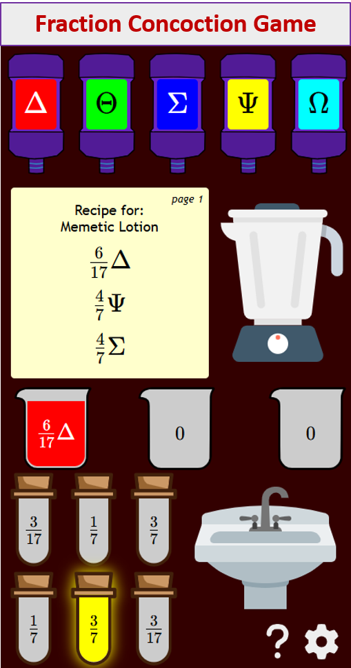
Try out our new and fun Fraction Concoction Game.
Add and subtract fractions to make exciting fraction concoctions following a recipe. There are four levels of difficulty: Easy, medium, hard and insane. Practice the basics of fraction addition and subtraction or challenge yourself with the insane level.

We welcome your feedback, comments and questions about this site or page. Please submit your feedback or enquiries via our Feedback page.